Bye Bye hassles,
Hey smart tools.

Sayyar is renting cars solution that provides an enhanced experience through all the renting process.

Team

Solo Project

Timeline

Website → 2024- 2025

App → 2023 - 2024

Project part

UX Research

Product Design

UX Writing

Tools

Figma

Figjam

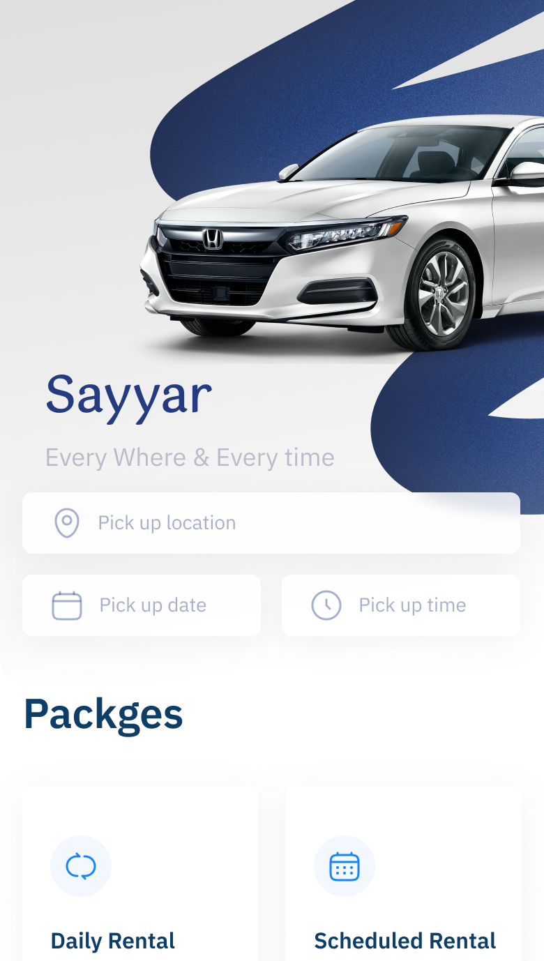
Sayyar home screen
Home page of Sayyar App
Sayyar
The Car you need.
From a place you can trust.
Defining the issue
Overview
based on my research I found that 80% of people had a bad experience with renting car, and just 20% of them thinking in renting car again.
Some of the common issues represented in the delay which takes 7-30 working days, also the car’s report that doesn’t include all the car flaws before renting. Additionally, the issue of users and service provider rights which are not usually clarified for each part.
Recruiting critiria

Shaping Design Through
The Eyes of Real Users

Users who rented a car at least once last year

📝

🚗

Users who rented a car and had troubles

😢

👎

Users who need to rent a car again

🔃

🚘

Interviews

One question away from better experiences

Users Group
Due 10 days
Based on Riyadh
20 participant
Based on your experience, will you rent a car again?
Did you rent a car in the past year?
Did you have problems while you rented a car?
Did you know your rights before renting a car?
Will enhancing the renting process motivate you to rent cars again?
Key findings

Ideas live where problems hide💡

Based on 20 participants, there are only 4 users who didn't have problems after renting a car.
*Based on the interviews, 80% of users had problems after renting a car.
Renting a car experience is improvable.
*Based on the interviews, 80% of users wouldn’t rent a car again if the renting experience didn’t change.
There’s a need for renting cars.
*Based on the interviews, 90% of users have rented a car in the last year.
Users didn’t understand their rights unless they had an issue after renting a car.
*Based on the interviews, 50% of users didn’t know their rights.
Solutions

The strategies I advocate 📝

🥰
Providing services that fit user's needs considering every step in their journey.
Personalizing the product as much as possible.
🤩
Making the experience user friendly.
👍
Providing services that guarantee quality and safety.
👤
Making the rights clear to the user.
Home page of Sayyar App
Information Architecture

Turning chaos into clarity

The interviews that we conducted helped us narrow down the personas that we always kept at the center of our decisions.
Low fidelity

Clarity starts here...

Defining the issue
Clarity starts here...
To identify the specific challenges users face when completing key tasks—such as renting a car based on preferences, picking up or receiving a vehicle at home, viewing contract details, and requesting services for the rented car.
Moderated usability study 👀
Interviwe particpants 👥
Task success rate ✅
User error rate ❌
Time on task ⏳
Insights

Seeing beyond the surface ✨

🔍
Users need to enhance their searching experience to choose the car they need based on certain details.
🔧
Users need to reorganize the navigation bar.
🤨
Users had difficulties realizing the difference between profile and home designs.
🚗
In the delivery of a car, Users need to track the cars.
📆
Users need to see the countdown days of the renting process.
🔔
Users need to have notifications about their rent inside the app.
Usability testing results
There’s always a next step to refine 👍
With assumptions
Before Usability
After Usability
🔍
Users need to enhance their searching experience to choose the car they need based on certain details.
Adding a button that catches their interest before they scroll down looking for a car will lead them to a journey of 5 steps to provide them results based on the user's preferences.
Before Usability
After Usability
🔧
Users need to reorganize the navigation bar.
Organizing the navigation bar to be: Home, Explore, Help, and Profile Starting with Frequent use.
With assumptions
With assumptions
After Usability
🤨
Users had difficulties realizing the difference between profile and home designs.
Enhancing the profile screen to make it simple and functional, displaying the most important information for the user.
User Interface
Design that speaks before users click
After an extensive journey of user experience research and analysis of user behaviors and preferences, I began implementing the designs for new features to create a cohesive experience that users enjoy and find valuable.

The look and feel of the application are intentionally simple, easy to navigate, and focused on the key elements that matter most to the user.
Car Delivery to Your Home
Simple and effortless
Track you car
Track you car
Based on your preferences
Smarter search, better matches
Based on your preferences
Smarter search, better matches
Track you car
Finding car for the user based on preferences
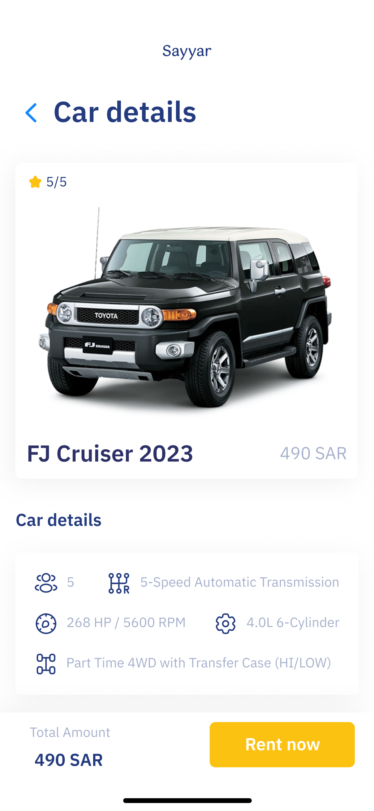
Car finder helps users easily discover their ideal car through enjoyable, preference-based filtering.
Bottom navigation bar
Inspired by the brand’s curves, the bottom navigation embodies its smoothness and flow.
Car services
Designed for instant clarity, showing users their rental features at first glance.
Customer service
What helps people helps business.
Customer service that work 24/7 to serve the users in best way
Tap to see the Prototype
Arrow
Results
The Outcome that Speaks...

🔎 Understanding User Pain Points

From interviews, I found that 80% of users faced issues while renting cars, and the same percentage said they would avoid renting again if the experience didn’t improve.

🧐Transparency Gap

I learned that 50% of users weren’t aware of their rights until a problem happened, which highlighted the need for better transparency and education in the process.

🧭 Usability Insights

Usability testing revealed that users struggled with navigation (confused between Home and Profile) and searching for cars, while also asking for real-time tracking and notifications.

🎨 Design Improvements

Based on these insights, I redesigned the navigation to prioritize the most-used pages (Home, Explore, Help, Profile) and updated the profile screen to show essential information first.

Lessons from Sayyar
What the journey 🚘 taught me
💡 Deep user empathy & research
Understanding real pain points drove thoughtful flows and clear communication.
🗂 Information architecture
Simplified navigation reduced cognitive load and improved usability.
🔄 Iterative testing
Refining personalization and progress tracking boosted satisfaction.
🤝 Trust & personalization
Clear user rights and tailored experiences increased engagement and loyalty.
🌟 Takeaway
Effective UX/UI blends strategy, empathy, and attention to interaction details.

Next Project

Innovation Center of Awqaf

Everything Begins with an idea

Let's Talk